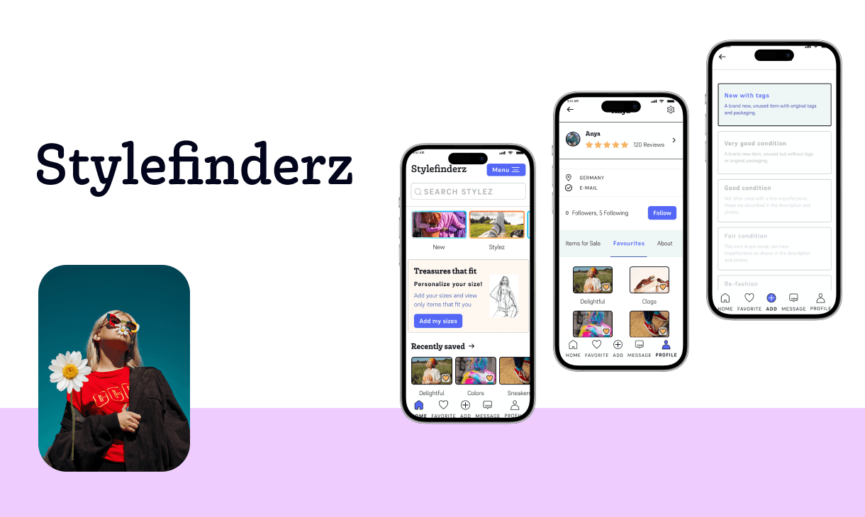
Stylefinderz
A vintage clothing web app for young style enthusiasts who wear their hearts on their sleeves.
Project Overview
Explore UI Interface Patterns that benefit a great Vintage Clothing App Experience
The Problem
Young adults want to look trendy but are also conscious of a sustainable and greener way of buying fashion. A lot of them reject fast fashion, opting for a more targeted and vintage shopping approach.
They frequently shop online and are used to an easy and fast way of reaching their goals such as:
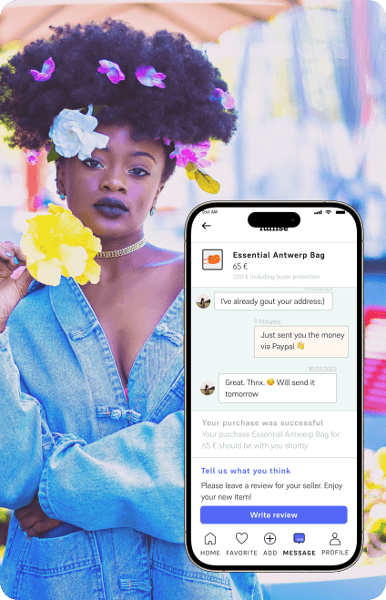
Finding, liking and buying new and vintage treatures
Selling their unwanted clothes
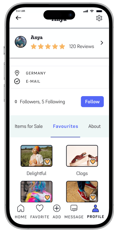
An individual and personalized space within a shop
Elevate their personal brand by participating in ratings and receiving them. Additionally this plays a crucial role in providing a secure community.
The Solution
Developing a user-centric brand identity involves finding and testing interface design patterns that make user interaction easy. The focus lies on task completion speed and minimizing a user's cognitive load by providing effective patterns.
My Contribution
UX
Desktop Research: e-commerce best practice components and patterns
Competitve analysis: Vinted and Vestiaire Collective
UI
Branding
Flow Design
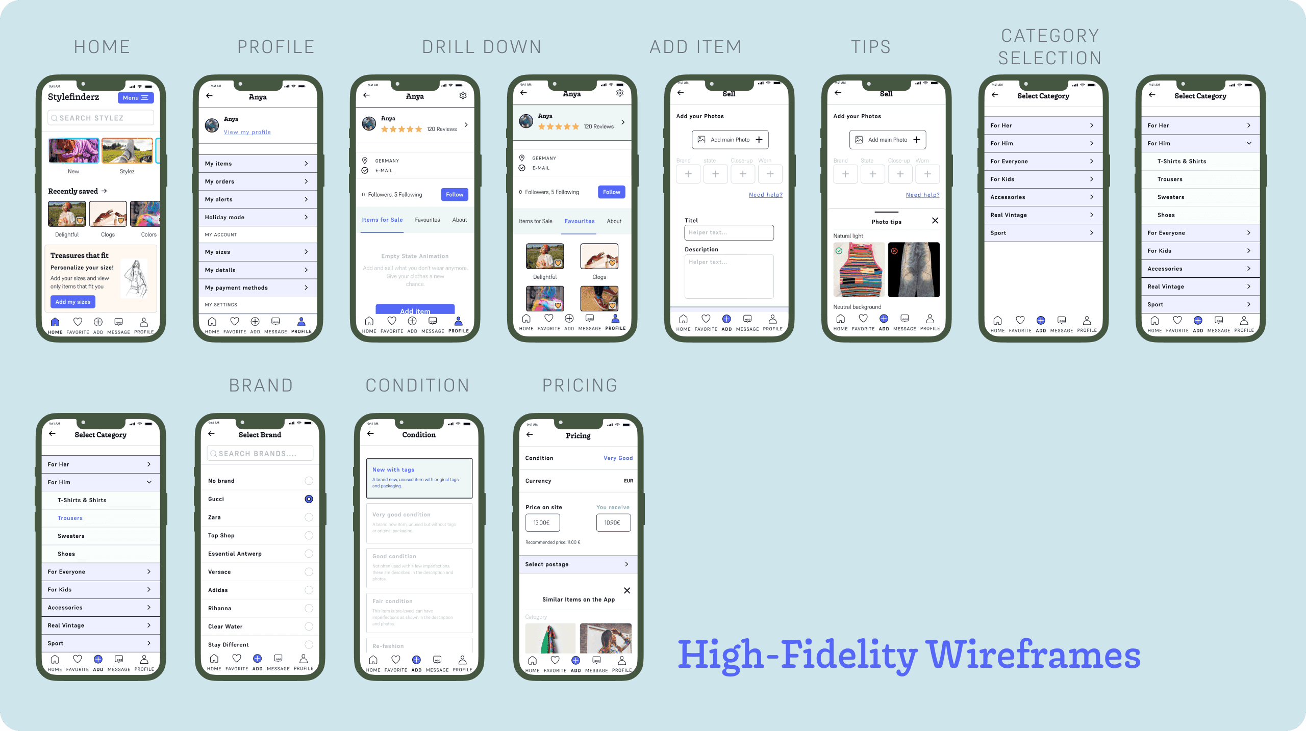
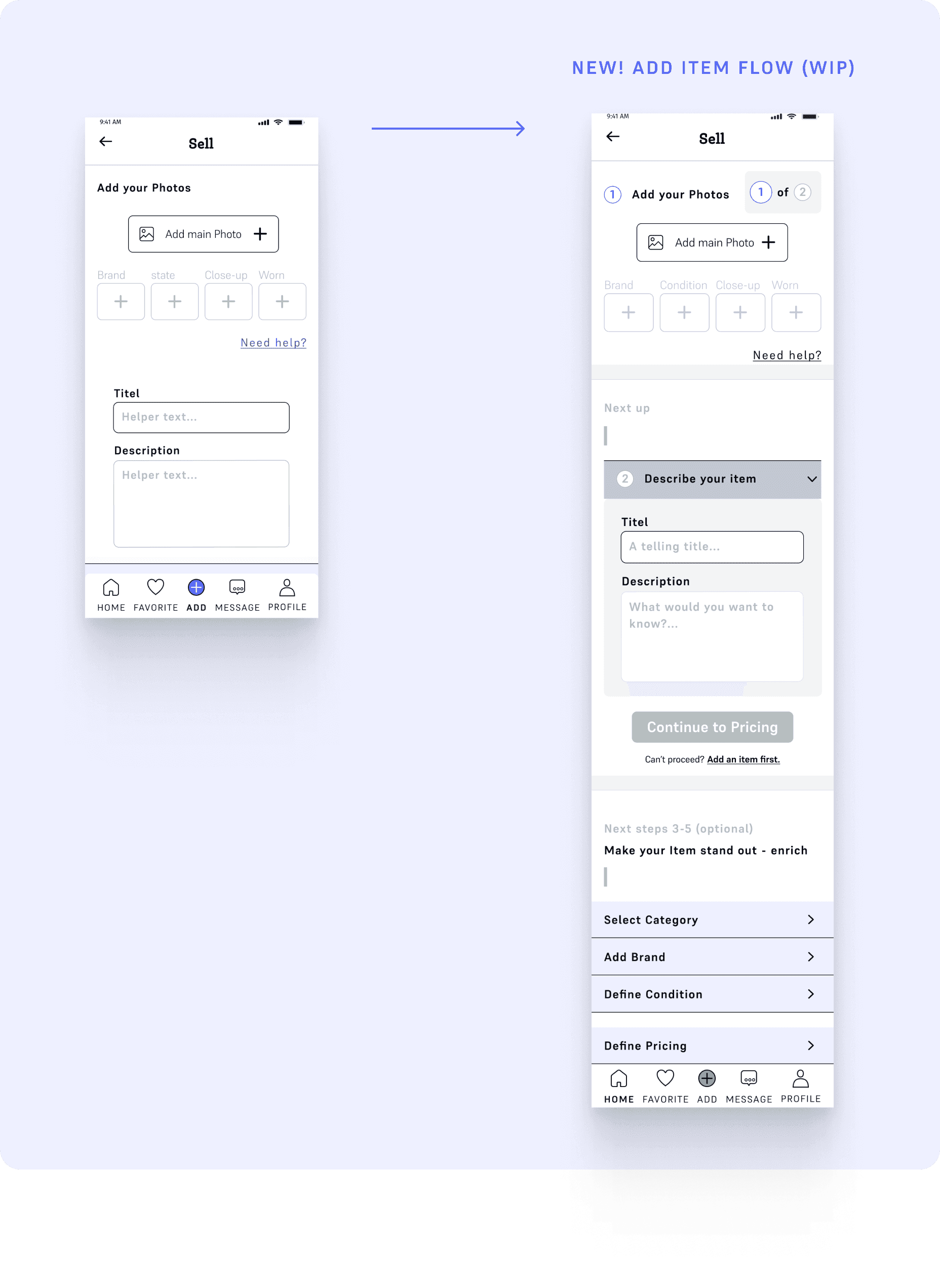
Low to High-Fidelity Wireframes
Preference Test
Final Responsive Design
The Team
Solo UX/UI Designer
Mentor & Tutor Team
Co-Students
Duration
4 Weeks — May to June 2023

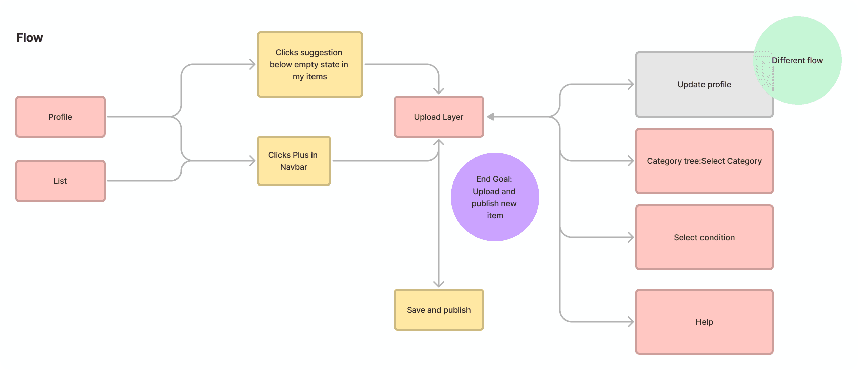
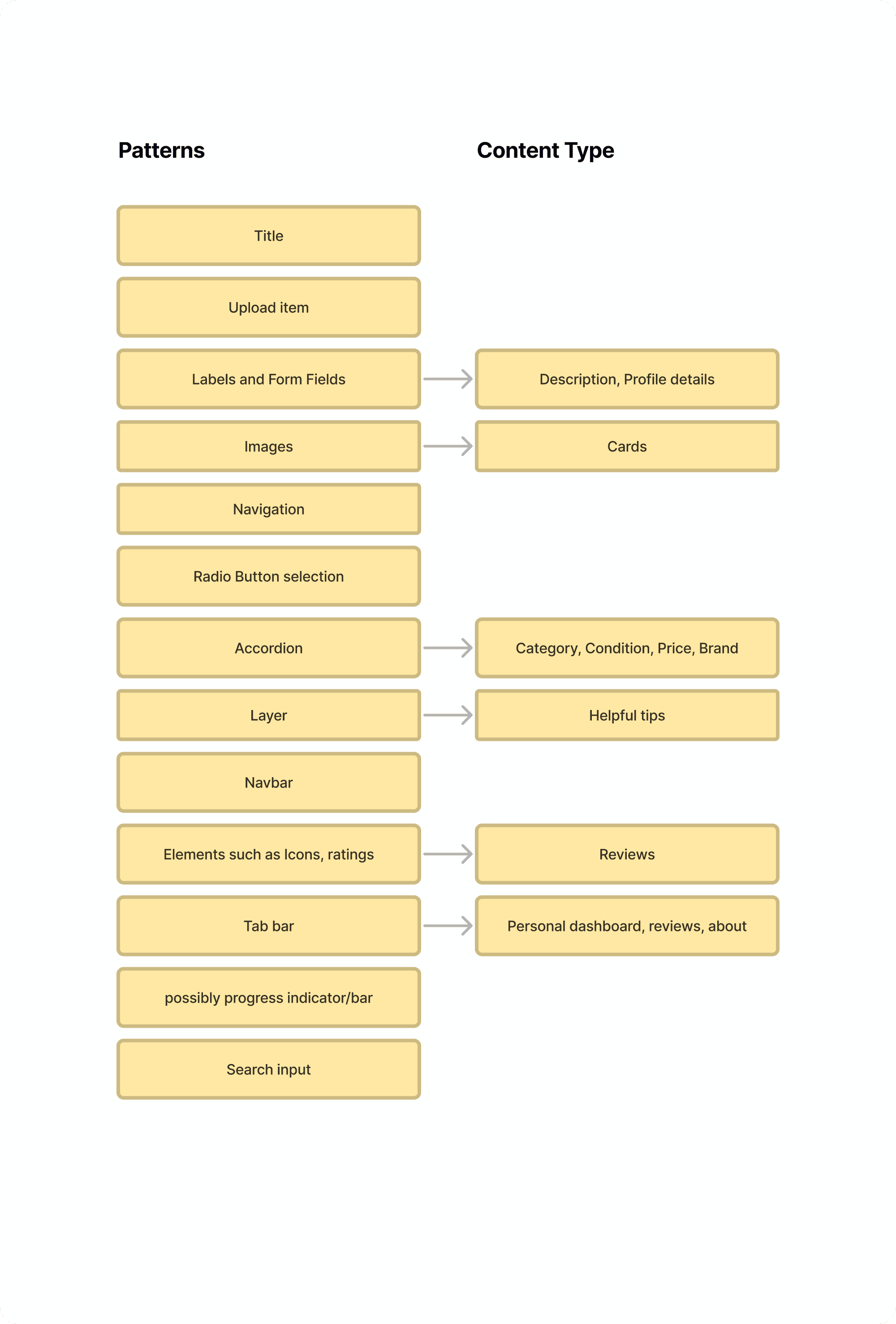
Fitting the content where it belongs
In order to to develop a suitable design direction and choose the right types of patterns it is crucial to map out the flows of the specified functionalities outlined in the brief. In addition, defining the content types and deciding where these should go is essential.
Particular functionalities specified in the brief
Create a profile
Upload items to sell
Picture galeries
Leave reviews
Autocomplete search, look ahead pattern
Extra: personalisation
“Inventing a new solution for every problem takes time, and is often unnecessary. We can rely on design patterns to avoid issues down the line.”
Vitaly Friedman
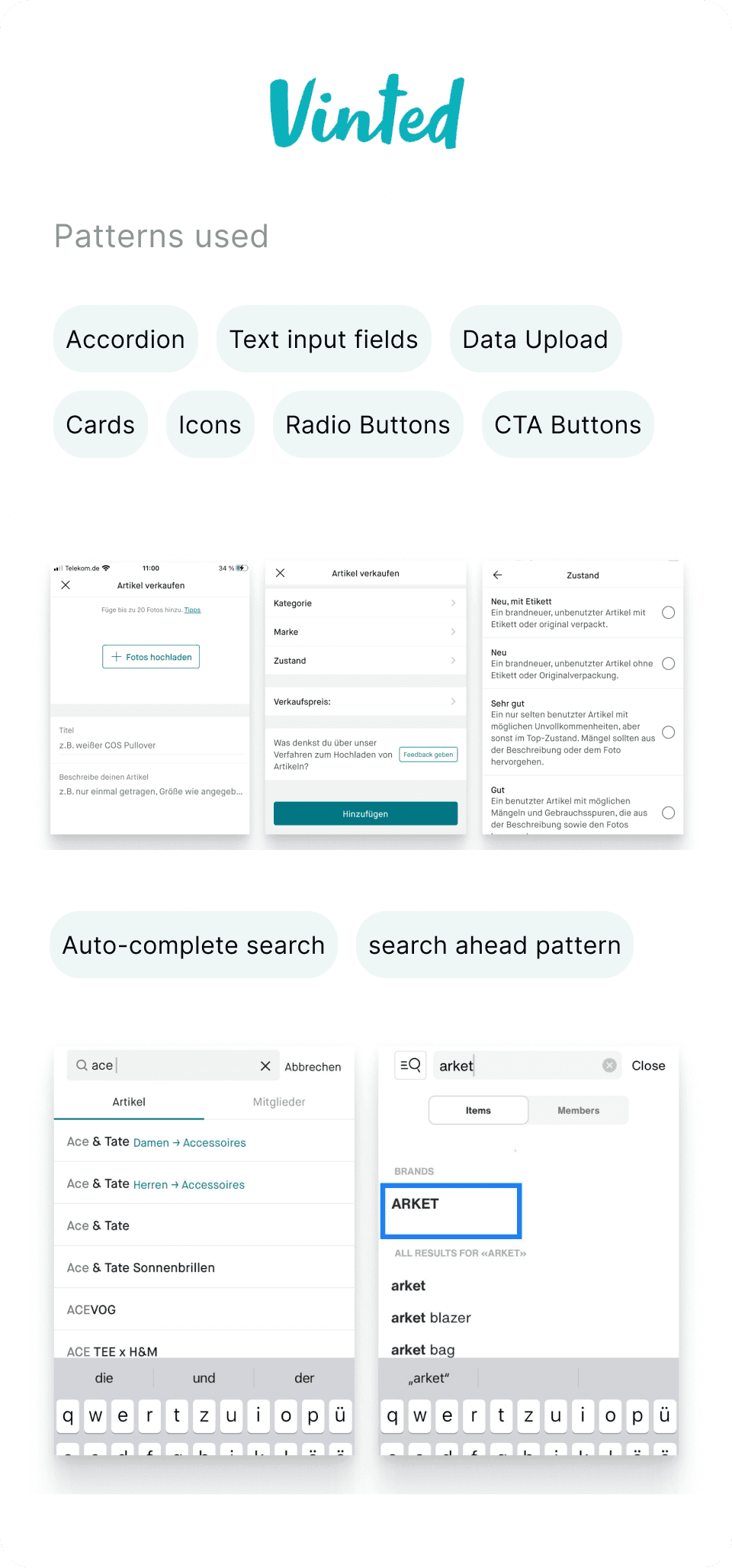

Desktop Research
I started out with desktop research and unpicked the seams of popular vintage clothing apps, in order to find the best suitable patterns for Stylefinderz. Searching beyond this realm of e-commerce sites is also a valuable practice.

Fashion is about change, but also about continuity.
Miuccia Prada
Feedback from my mentor
Since the Stylefinderz project was part of my UI upskilling, I also learned a few things along the way.
Naming
A consistent naming strategy is key. Especially when working within a team and working with a design system.
Use of Color
Make sure the contrast passes the AA contrast, this applies in particular for fonts on a background color.
Stay consistent with the application of primary and secondary colors. Use the primary color (in Stylefinderz a bright blue) for all interactive items to support the user in learning and navigating through the app.
In the case of Stylefinderz, I initially applied the secondary green to the main navigation. I changed this to my primary blue.
Icons that signify something like marking your favorites need to stand out on any background. When considering an edge case, like a very lively image, the iconcolor and it's background should be considered, to allow it to stand out at all times.
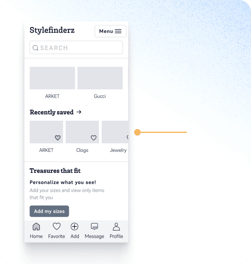
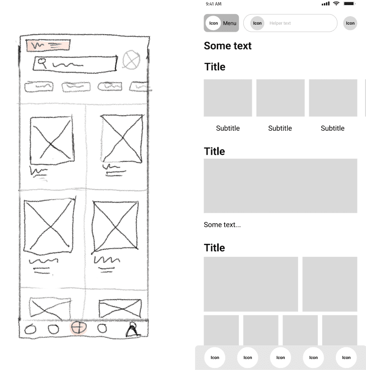
Patterns on the Home Page
sliding teaser
personalization
recent interactions to draw back in
easy access to the main interactions
within the Navbar
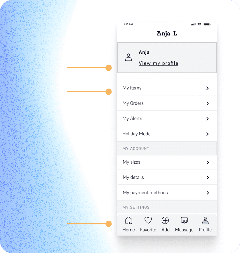
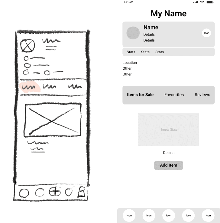
Patterns - Profile Page
a clearly marked link (primary color) indicates that there is a sub-page
accordions make it easy to scan and reach profile sub-sections
bottom nav-bar for easy reach of all main interactions