Routehoppers
Leap along hidden gems on your trip. Discover and curate unique travel experiences with Routehoppers.
Project Overview
Leap to the next hidden gem on your trip with Routehoppers
The Problem
People love planning their next trip, because part of the thrill of traveling starts long before you arrive. It begins with picturing and anticipating a journey. Yet, the journey itself is frequently overlooked and this results in unplanned stress, which leaves an unsatisfactory gap in the overall travel experience.
The Solution
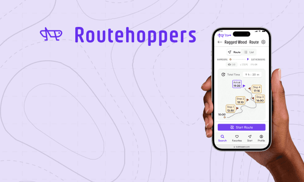
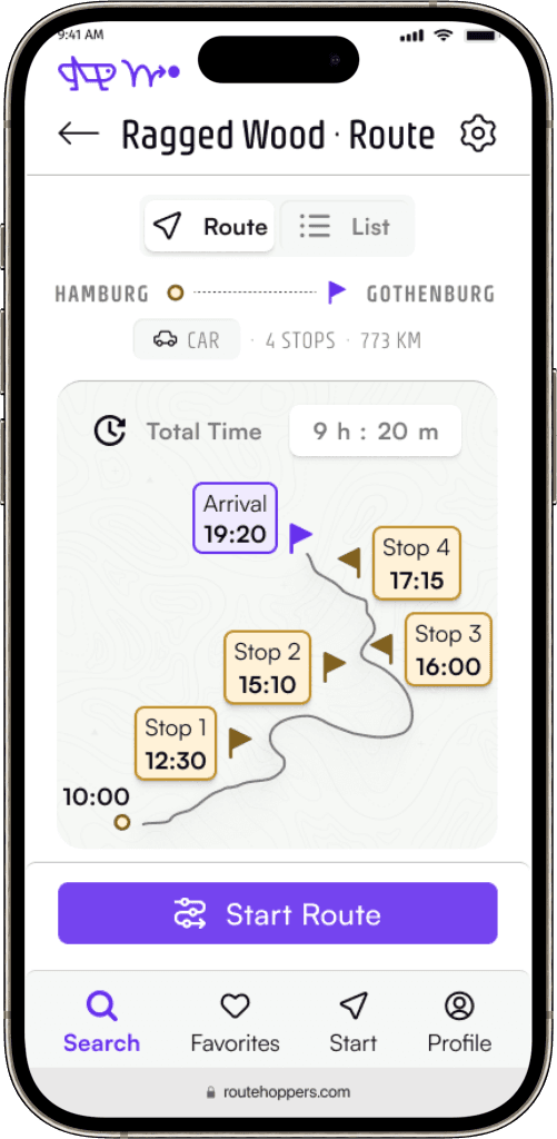
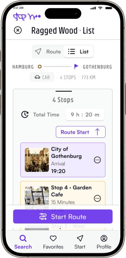
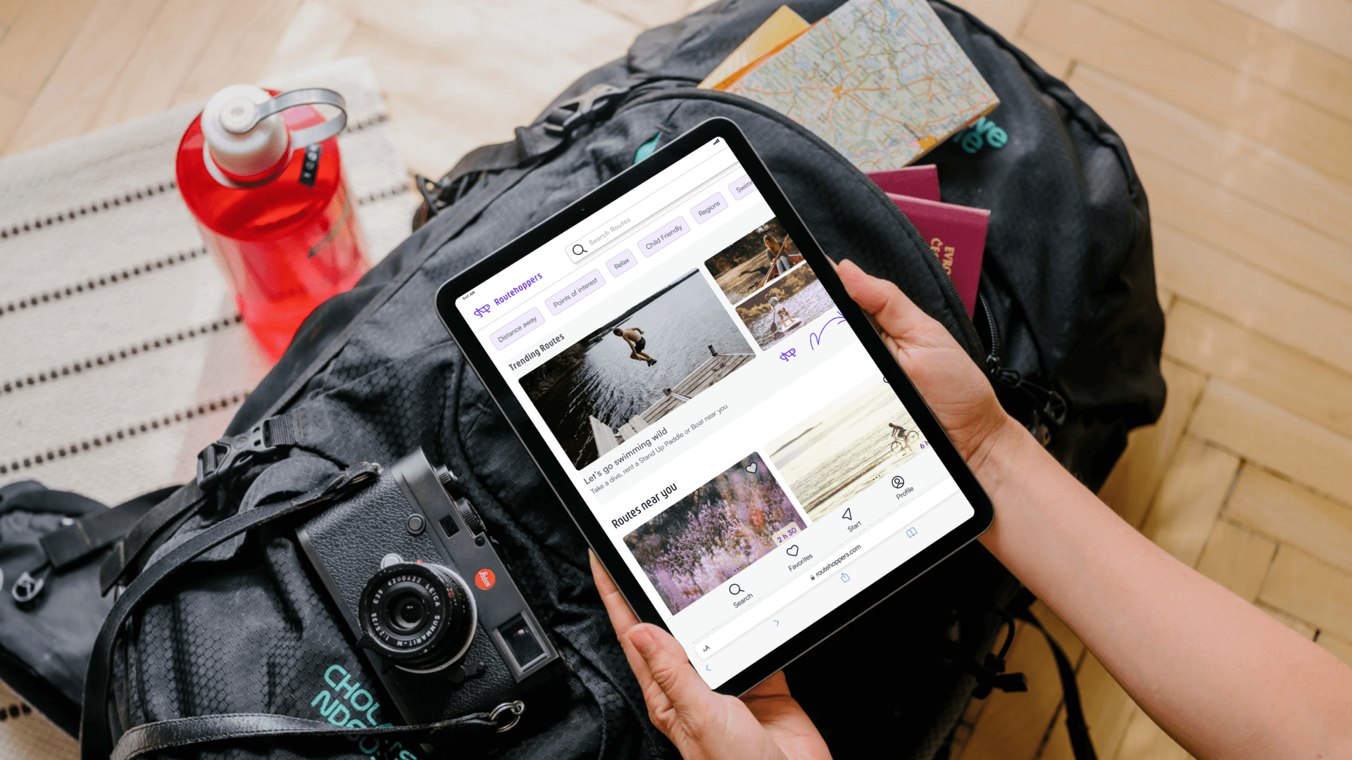
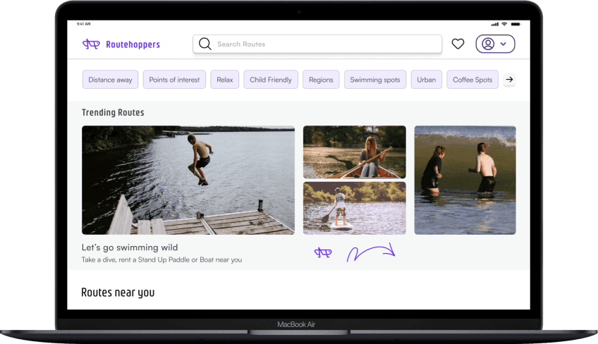
A responsive web app for location-based recommendations.
Make the journey to their planned travel destination a worthwhile and anticipated experience in itself.
Routehoppers makes personalized suggestions based on the traveler’s direction. These suggestions can be valuable experiences, stops or sites for breaks perfectly tailored to individual interests, available time and unique travel requirements.
My Contribution
Idea and Concept
The idea is entirely my own. It is based on brainstorming a need that I discovered during my travels.
UX
Discovery
Desktop Research; competitive Analysis
Discovery: User Interviews
Data from Synthesis
UX
Working with Data
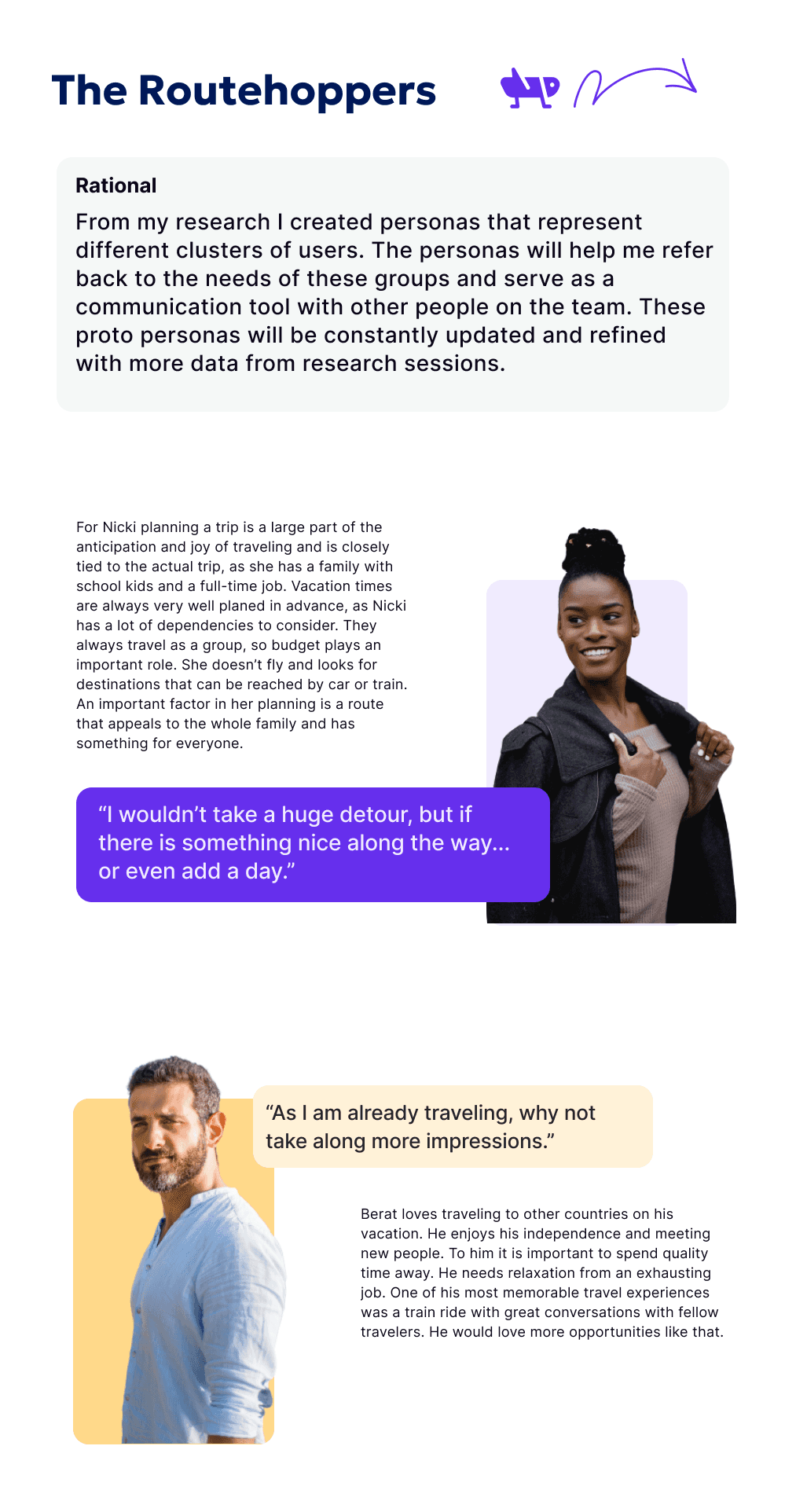
Proto Personas based on research
Jobs to be Done Framework and Flow Diagram
MVP & refined hypothesis
Responsive wireframes
Prototype & Usability tests
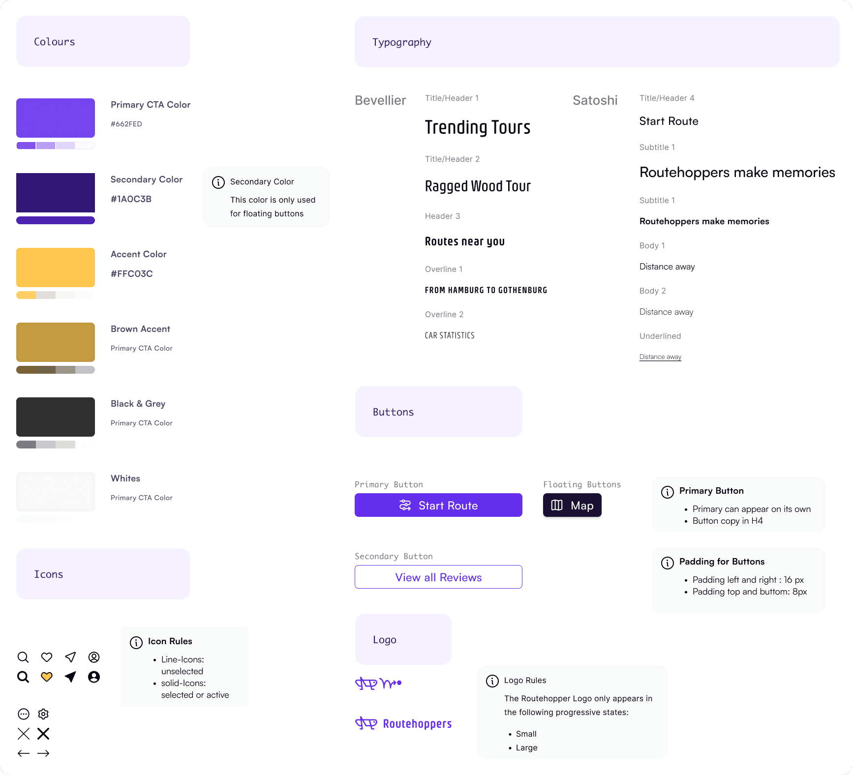
UI
Design Direction, Interactions
The Company
A travel web app
Team: CareerFoundry mentor, tutor, Testees, fellow students
Duration
10 Weeks — September to mid October 2023
Begin Designing with a Map
The double diamond model fits the Routehoppers project, as it encourages you as a designer to start with broad ideas and then refine them in iterative steps based on project needs. Since the original idea for Routehoppers was broad and based on assumptions, the double diamond resonated with me as it serves as a map allowing you to zoom in and out of details in successive rounds. The double diamond helped me focus my ideas and evaluate the project's progress effectively.
Study the Competitors
To gain insight on what the market already has to offer, I conducted a thorough analysis of existing solutions on the market . This included the types of solutions to problems they address and the patterns and components they use. By this I ensured that Routehoppers would be intuitive and familiar to potential users.
UX Analysis of Airbnb
Positive
Unique filter for accommodation
Easy incremental navigation for visitors or a step by step set up for hosts
The experience on the native app and on the web is equally great
The focus is on searching and narrowing down your selection as easily as possible until you can book
Negative
Some grey UX Patterns, when selecting reserve the default radio button is always the full price to be payed immediately. You have to concentrate and actively change that as a user
The customer support has not always been great, especially during the pandemic, where you had to prove why you couldn’t travel
UX Analysis of OpenTable
Positive
The native app works much better than the web app
The CTAs that stand out mostly point towards booking a table (times, complete reservation) and that is the overall business model of this app
Generally the app is logically organized. The Home section is easily found
Negative
The patterns differ (native versus web), which makes it difficult for users to jump between the two
As a user it is difficult to interpret exact price ranges from icons like these: $$, $$$, $$$$
It seems like only up-market restaurants are listed
The small fonts make reading the copy a little bit of an effort, especially on the go or in difficult lighting situations
I am designing for travelers looking for scenic breaks and worthwhile experiences.
Synthesized hypothesis
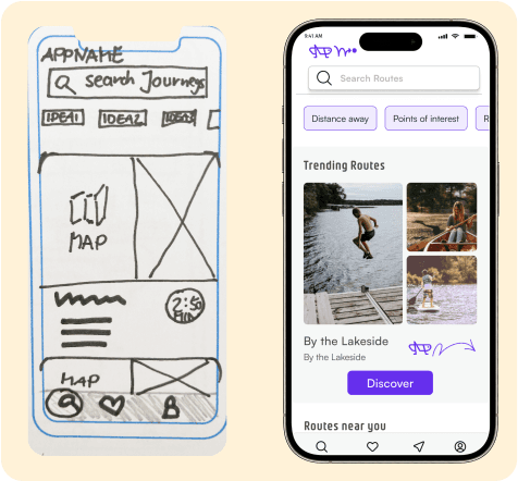
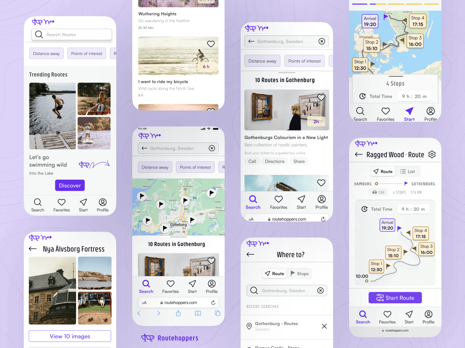
Home page
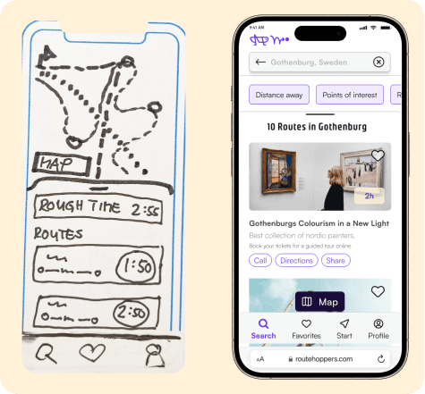
Filterered Resultspage
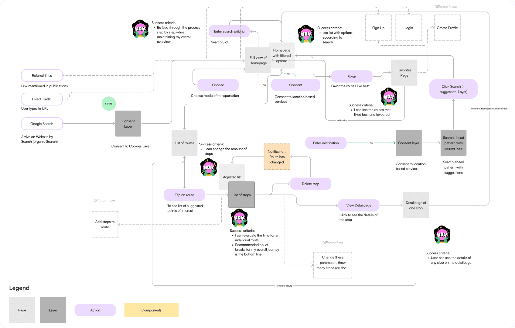
This user flow diagram for Routehoppers comprises of user tasks, showing the success criteria at each user milestone. It helps with maintaining the birds-eye perspective and offers insights into a user’s journey and potential challenges they might face.
Needs reframed as User Stories (Jobs to be done)
As a user, I want to see a variety of route options with different attributes when searching, so I can choose the one that best suits my needs.
As a first-time holiday planner, I want to search for routes to my destination, including both the fastest option and an estimate of a less direct route. This way, I can visualize travel times directly on the map.
While searching for routes, I want to see suggested points of interest along each option. This will allow me to choose a route that incorporates interesting stops that align with my travel preferences.
When encountering points of interest along my route, I want to access detailed information for each POI. This will allow me to assess their value and determine if they are worth a detour or stop.
When I search for my route I want to enter my basic data points in an easy way so that I can keep a good overview.
When I search for routes I want to be able to save them and access them later (for a later MVP).
Ideas are always fragile. All ideas have problems, and if you don't suspend your disbelief and trust that you will find a solution, you will lose faith in your idea.
Source: Jony Ive
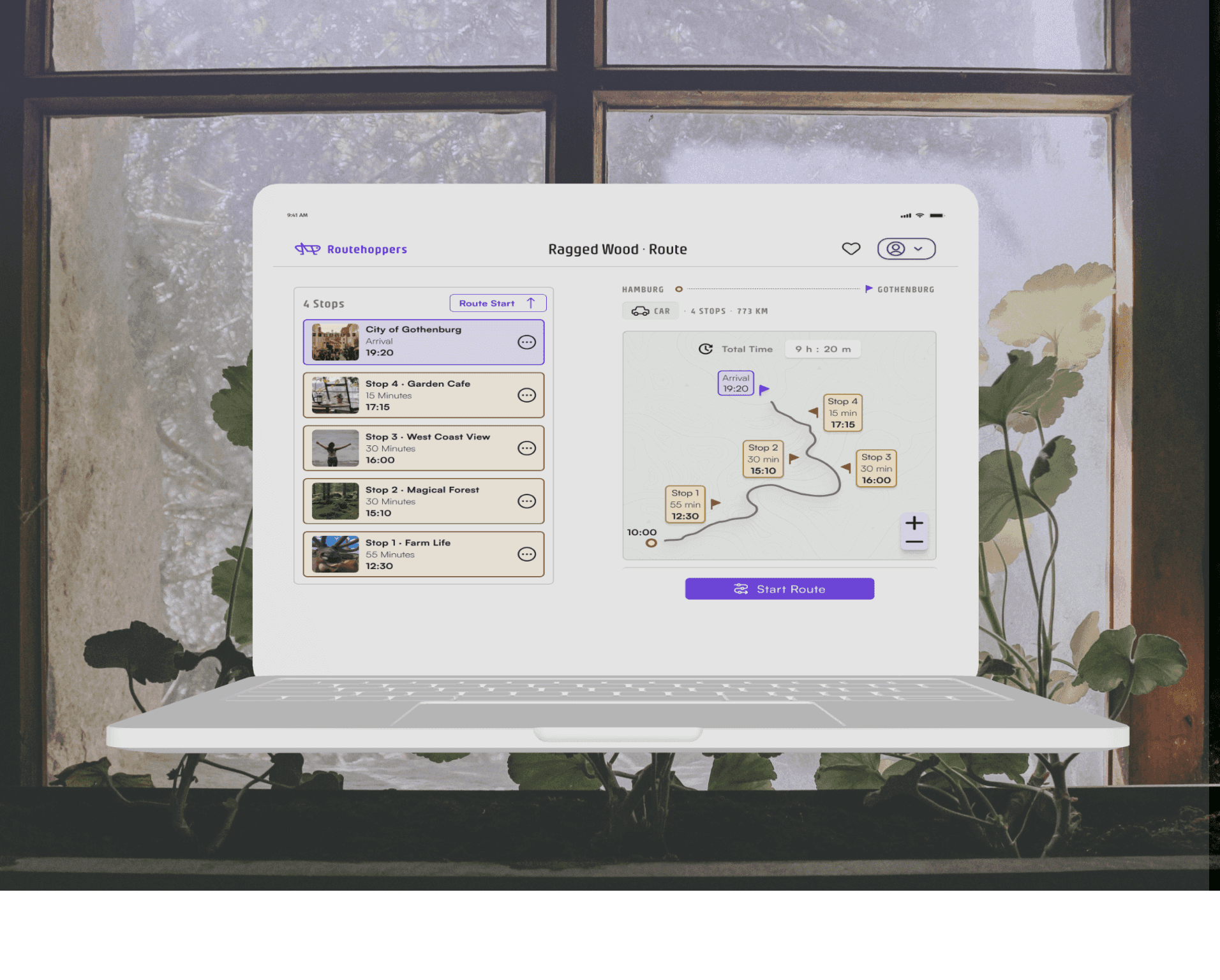
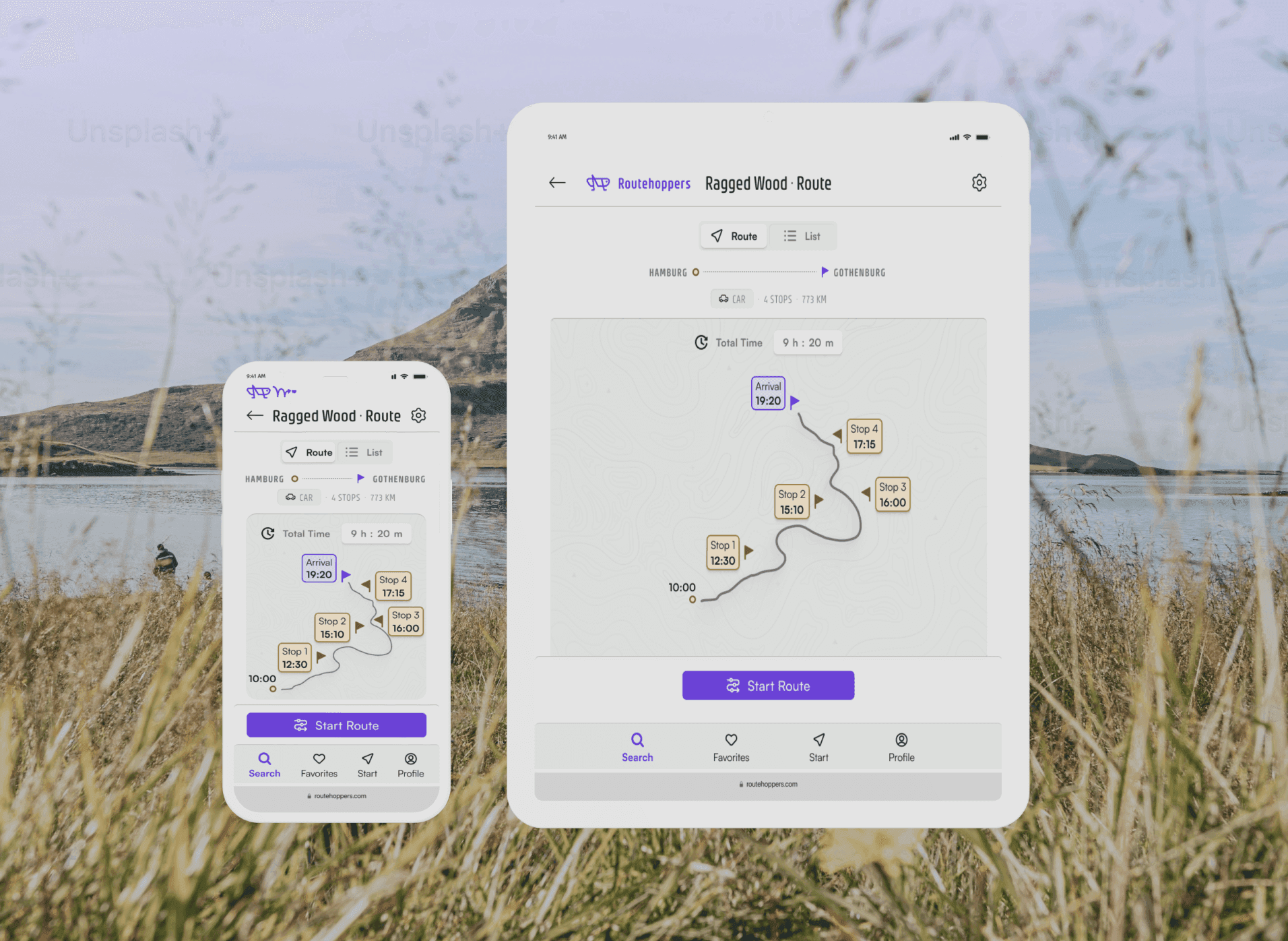
Responsive Design for Routehoppers
Each breakpoint offers it's unique possibilities. Desktop can enable the traveler to view the entire scope of a journey and plan their route with a bird's eye view of everything in advance.
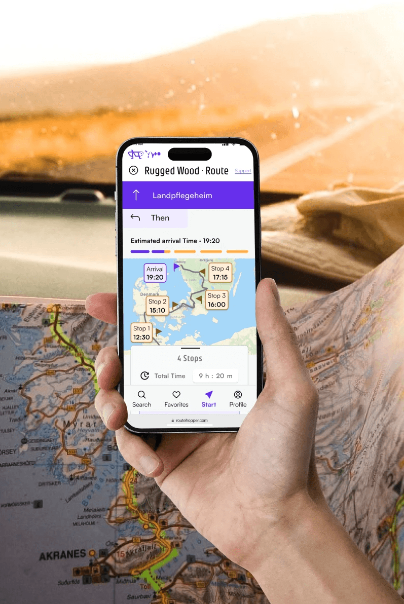
Mobile Views
The mobile views invite the user to focus on one specific part of the trip and can easily switch between visualizations.